The new SKODA ad' cleverly uses a theme of space and rockets to communicate the cars features. Sounds of rockets taking off suggest there is allot of power in the engine and the anti-gravity shows the space the car has. It says 'Travel in space' which could be a homonym for the amount of space there is in the car which captors to people especially with kids like in the ad'. I love how it plays with the realistic imagination of the child using the sound effects of a rocket and anti gravity in the car. Overall i think its a successful ad' and that will appeal to mainly families effectively.
Saturday, 24 October 2015
Wednesday, 21 October 2015
Most romantic ad' i've ever seen
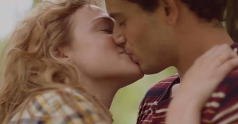
This is the most romantic story in an ad' i have ever seen. The story line gave me goosebumps even before it reached the main part through the simple gesture of offering someone chewing gum. It plays on this gesture throughout as their relationship develops from high school to now. An example is when they have an argument and they make up when she offers him a stick of gum suggesting to the audience, that it can solve problems and be used as an act of kindness.
I shed a tear at the end when he shows their life through stages of chewing gum wrappers in a gallery and the last is a marriage proposal. You can feel the love and history communicated between the two people in under 2 minutes as you watch their relationship unwrap (like chewing gum). In my opinion it has everything it needs to be a successful ad'.
click here to watch.
Tuesday, 20 October 2015
Buenos Aires- Cycling health
This is a campaign in Buenos Aires to promote the city to improve their heath. It was created by La Comunidad an Argentinian studio. They have used cycling as their base to persuade people to do more exercise and in the long run educe traffic congestion and CO2 car emissions.
I love how the ads have used the bike wheels within the body parts. It also makes it seem like the wheel is needed for each part to run smoothly like its part of the mechanics. It could also cater to the already bike enthusiasts that (especially with the lungs), live and 'breath' the sport. Once created they were put all round the city attracting people with the bright colours and creative imagery.

Monday, 19 October 2015
New look for the Pizza Hut brand
Pizza Hut has recently been advertising its new look. Everything is changing from the menu to the decor giving a more american diner vibe. It is similar to TGI Fridays which is seen as a more sophisticated less child directed restaurant which is what i think they were aiming for. The logo above has become more slimline and basic like the Zizi's, a higher class restaurant. I think they have taken a risk by changing the brand look however I think it will be successful.
The interior design has been revamped with vintage but also modern touches. The bar has been put in to appeal more to adults so they feel the environment is catered to them as well as their children. The bar is similar to the one in TGI Fridays shown below which could indicate they are trying to gain a similar reputation.
On the website they say 'We like to think of it as Freedom. Freedom from… well, never mind that; let's just say Freedom to choose. So grab your taste buddies and let's hustle!'
This is trying to promote their new look and get you to come down and experience the 'freedom'. They have also put together a TV ad' featuring allot of bright colours and exploding foods. I think it is fantastic to show the new vibe and give the impression that in Pizza Hut no one can tell you what to do, your in charge.
click here to see the ad'
Sunday, 18 October 2015
what are amazon dash buttons?
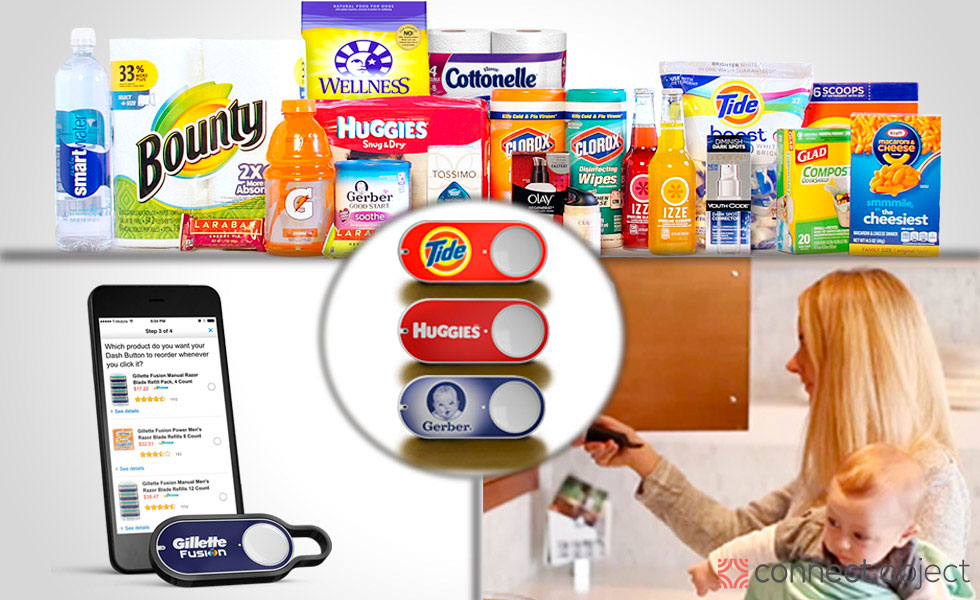
The Amazon Dash Button is the new way to order your essentials and all you need is the free Amazon app. This is a wifi connected device that re-orderes your selected item to your door with the push of a button. The idea is based around products that are part of a daily routine and how it can be stressful if they run out such as hair gel or washing powder.
They price at $5.99 each on the Amazon website and they also have a video to show how they can aid your lifestyle. The video has the rhythm of a daily routine slowly using up products till they run out. This shows how stressful life can be without the button however with it, your daily rhythm will never be disrupted.
click here to watch the ad'.
Friday, 16 October 2015
McDonald's open at night
This shell ad' was launched to announce that McDonald's restaurants would be open at night. It is an interactive sign that only works at night when the other half of the arch to is reflected in the glass to make the iconic 'M'. It was created by DDB Sydney with Matt Eastwood as the creative director. I love the creativity and even though it may not be as effective in the day, at night it would catch peoples eye.
This one was on a highway in america made of reflective tape. When headlights reflect from it i feel it looks quite ghostly as the letters appear to be floating which fits the night time theme.
I personally think it is quite dangerous as it could be distracting when it suddenly lights up. However it gets the message across and if your tired driving at night it might be just what you need to have a break from the journey.
Thursday, 15 October 2015
Have children lost their imagination?
Have this generation of children lost their imagination, urge to explore and love of the outdoors? Well a campaign has been launched to get children to explore the outdoors like they do their virtual games. The US Forest Service's 'discover the forest' campaign used a fake VR headset so children thought they were in a virtual world. However when they take them off they realise they have their own HD Surround Sound world to play in. This voices the importance of children playing outdoor and using their imaginations to entertain themselves in an open social environment. Not created for them on a screen.
click here to watch the ad and see how the children reacted to the experiment.
Subscribe to:
Posts (Atom)