Sunday 13 December 2015

Wendigo's dark brand design


Wendigo's brand is a film and video production agency. The name comes from a mythical half-beast creature that was once human. However after being forced to eat human flesh to survive, they become monsters that are possessed. After their transformation, they crave human flesh. In this instance, The metaphore is that the Wendigo is a beast that feeds on creativity.


These images are from the Distillery website which is a creative studio specialising in art design. They were approached to create this identity and they have done an amazing job! It is dark and mysterious with an earthy look which matches the story of the Wendigo with the twig and bone like imagery structuring the type. 


Wednesday 9 December 2015

urban outfitters- Kent State Mistake


This Vintage Kent State Sweatshirt had little meaning but a fashionable unique piece of clothing to Urban Outfitters. However on May 4th 1970 Kent State experienced a tragic shooting which killed 4 of their students. The aspect of the top that has risen concern is the tie die which looks like blood splatters. This is an unfortunate mistake however very insensitive to the people effected by the shootings in 1970. 
Urban outfitters were forced to apologise as they were accused of exploiting the tragedy for profit. “The red stains are discolouration from the original shade of the shirt and the holes are from natural wear and fray,” the spokesperson said. 

Is Yik Yak good for uni students?


There have been allot of different approaches to Yik Yak. Mainly with university students there have been debates about it being banned due to abuse and antisocial behaviour. Recently 72 feminist and civil rights groups including the Feminist Majority Foundation, the Human Rights Campaign, and the National Organization for Women asked the Department of Education to crack down on Yik Yak.

The university of Mary Washington made a statement at a press conference due to sexual assault due to Yik Yak. They had an incident where a 'yak' was written to threaten a member of the feminist society with rape. After this they tried to spread the word to report any other abuse posted to try and reduce the numbers of people being targeted. 

However on the other hand there have been positives to the app. In Michigan an anonymous yak was written about someone debating suicide. It was immediately bombarded with comments telling the person to 'stay strong' and people talking about them being in the same situation and getting over it. This shows it can be a good way to express feelings you can't when you are identified.

lifesize PNC gingerbread bank


This is a bank made of 5,000 pounds of gingerbread. Deutsch made this for PNC to advertise their 12 days of christmas price index. "The Christmas Price Index was created to make learning about the economy a bit more fun," said Jeremy Bernstein.
It was developed in 6 months and took 4 days to build. Deutsch also created their own illustrations for each column of the 12 days of christmas.


It is made from inedible gingerbread as it had to be treated for durability and weatherproofing that provided actual banking services—customers could use the ATM. 17 percent of the 5,465 visitors did use the atm or open a new account.

Emoji popularity


Emojis are the new way of communicating feelings in social media and messaging. People can simply tweet one emoji and they can express their feelings at that moment in time. 
Jonathan Fisher studied different languages using different Emojis or Emojis in different categories such as love or happy. 

This chart shows emoji use all over the world and the categories they are in. However when you break it down you find that different countries and languages use different emojis. 

Arabic speakers use flower and plant emojis more than 4 times the average use. They also use 2/3 more sun and heart emojis.

French speakers use 4 times the heart emoji than any other language and they have 86%more positivity in their emoji choice.

Australians double the amount of alcohol related emojis!

When it comes to the funny emojis e.g. the poo Malaysian speakers use the most and Russia the least.

Finally Americans use the LGBT emojis 30% more than average such as rainbows and same sex holding hands.

This shows that different regions have different perspectives and beliefs in life. However overall 70%of emoji use is positive.

Friday 4 December 2015

Beautiful 2016 Pantone Colours


The new pantone colours of 2016 are Rose Quartz and Serenity which connect with each other beautifully. “a harmonious pairing of inviting shades that embody a mind-set of tranquility and inner peace,” says Pantone. The pink and blue represent female and male equality relating to the recent gender blur in fashion which has effected colour blends in other areas of design. It also relates to society moving towards more multicultural blending and gender equality to become one equal society. This can be shown as the colours blend in the middle of each image.


Artificially Intelligent poster to change future advertising


This poster was created by M&C Saatchi, Clear Channel and Posterscope in London. it is designed with a camera to test the emotions of people when they react to different ad's they see. To test this they made a boring fake brand (picture below) to see peoples reactions to the boring font and typical coffee colours. The idea of the whole thing is to see which ad's characteristics get the best reaction.

They described each part of an ad' e.g. font and colour, as if they were genes in DNA. This experiment will determine which 'genes' should be used in future ad's like selective breeding of animals. The characteristics that fall to trigger an engagement will be killed off and the ones that do will be passed on to future advertisements. 
click here to see where the ideas came from.


Thursday 3 December 2015

Alyssa Monks- Self inspired art


Alyssa Monks is an artist with a B.A from Boston college with studies of paintings at Lorenzo de' Medici in florence. She went to complete her M.F.A at the New York Academy of Art graduating in 2001.
Her art is based on her own life experiences and usually painted where the women are vunerable. She uses her insight of being a woman to express the venerability women feel at different stages of her life. she very rarely paints men as she has no personal connection to how men feel. 


Although her paintings are very realistic she doesn't want to be labelled as a photorealist as it isn't her intention to create a painting that looks like a photograph, its to create the illusion of real life in paint the closer you get to it. In these pieces she was experimenting with the distorted shapes you get when underwater or behind steamed glass, with also a focus on underwater creatures. 


Monday 30 November 2015

Brandalism- The Climate Games


These two images are from the Brandalism campaign for the climate of Paris. 80 artists and 200 prints were the masterminds behind this where they changed hijacked 600 locations around the city without permission but for a good cause. The COP21 Climate Conference came at the right time for these environmentalists the objective was to highlight the negative impact these companies have on the environment. Many people have been aware of the VW scandal and above these whitty comments say it all. a street artist called Barnbrook created these. 


This one is to show up Airfrance as they have past reputations of being a non eco friendly company. I like how it looks like a real airline ad and she's shushing because its a relaxing flight however there is a twist on their scandals being a secret. The quote is also targeting other airlines by saying 'of course not we're an airline' highlighting how bad airlines are for the environment and how much fuel they use.  

This one has less of a hidden whitty message and is straight to the point about the companies violations of the environment. 
click here to watch the production of the ads


Quality Street- First sign of christmas.


The recent Quality Street christmas ad' was based around when you see snow for the first time and if feels like christmas. "The proper start of Christmas is when the Quality Street tub appears. It's as magical as the first snowflake," says J. Walter Thompson London creative director David Masterman.The directors wanted to create the feel of what Quality Street would be like if it was a real road, warmth, family and fun. I personally think they have done well to simply capture the fun of christmas without a long winded emotional story like other ads'
To produce this they ordered 45,000 sweet wrappers to make it look like snow in the wind and for this to happen nestle changed their production like for 2 hours to just make the wrappers. They also made a short clip about the production of the ad which you can watch below

click here  for behind the scenes 
click here to watch the ad'.

Sunday 22 November 2015

Pray for Paris- Facebook campaign


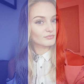
The paris attacks have been all over the news and everyone has been showing their support. Facebook has launched technology where you have the option to change your profile picture to be the colours of the French flag. It is a good way to show your support and see all the other supporters out there mourning the deaths in Paris.
However  In a phenomenon researchers have dubbed "slacktivism," a study from the University of British Columbia revealed that posting support online enables people to associate with causes but makes them less likely to commit any resources to them. 

The daily mail has reported how ISIS have responded to this. They have started a trend for their supporters by having a french flag with an army boot footprint on as your  profile picture on twitter. 


Friday 20 November 2015

Boy in the Barbie ad'


The new Barbie ad' is as cheesy as ever however this sassy little boy has drawn attention to many viewers. The ad' is for barbies featuring the Moschino clothing by their creative director Jeremy Scott. The little boy is said to be a younger version of himself. Scott says. "Barbie was more than a toy, she was a muse for me." which is what lead to there being a boy used in the ad' and that how you play with barbies is about self expression and fun.


Thursday 19 November 2015

M&S clothing christmas ad'- alternative


The M&S christmas ad' this year has taken a different path to those such as John lewis telling a story and telling the 'true' meaning of christmas. They have gone for a more glamorous fun approach using stereotypical christmas colours that tend to be red and gold the most luxurious theme. They have also used the present box throughout communicating the message that you can buy your presents from M&S. This along with the range of adults and children shows its a diverse store that is fun for all ages to get into the christmas spirit along with looking glam. The song 'uptown funk' also puts you in a good mood when watching the ad' appealing to the younger generation. 


M&S Food- Christmas ad'


M&S christmas ads never fail to emphasise the luxury of the food. All the intricate detail of the christmas food is bought out by the clever yet simple presentation of the ad'. Along with the modern song 'rather be' by clean bandit it not only attracts the attention of their typical adult audience but also the younger generation that recognise the tune. 
They use the black background to contrast with the food so the audience is fully focused on what they're trying to promote. I love the screen shot i took above as it looks like snow communicating stereotypes of christmas and getting everyone in the spirit.  
They also use allot of gold like shown in the picture below. This connotes high quality and wealth as their target market tends to be upper class and this is what most people aspire to be. This again draws them in creating a relationship by supplying things the audience member wants. 

Saturday 14 November 2015

Pepsi logo change


This shows the evolution of the Pepsi logo from 1898 to today and it is surprising how many times they have changed it. The original font from 1898 to 1950 resembles coke's type as that was their competitor when they launched. However in 1962 they created their own identity with the bold capital letters over the same cap as 1950. 

The newest logo has raised some concerns with the public that it looks like an overweight man. This connotes that the drink will make you put on weight and that even the diet one is bad for you. However the brand was going for a logo representing the earths gravitational pull and feng shui which i feel they have made. I think the 1 million was well spent in creating a cleaner logo following the trend of Apple and their simplicity. 

Monday 9 November 2015

Audi R8 ad'


The Audi R8 created by DDB London starts with an eye being almost memorised by the car. The pupil moves in time with the car changing gears and the sounds it makes showing the thrill it gives the body. This makes me think that the person and the car are in sync with each other and shows the effect it has on the driver. I love that even though in the first half of the ad' you can't see the car you still make the connection from the sounds and eye reactions with the street lights reflecting back.
click here to watch the ad'.

Sunday 8 November 2015

Barbie-imagine the possibilities


Firstly I love it when ad's use kids imaginations to voice the product. The barbie ad' does just this by showing little girls doing their dream job by role playing with their dolls. It is a hidden camera that captures the reactions of the adults that see the kids in professional roles such as a professor, vet, coach and business woman. My favourite is the little girl running the warm up for the rugby team as they are so masculine and she's telling them to keep their knees up high 'like a unicorn'. 

click here  to watch the ad'

Saturday 7 November 2015

Tesco 'Spookermarket'


Tesco launched an advert filmed live of customers experiencing a kind of haunted house/ supermarket. The campaign named 'spookermarket' by BHH London. The reaction of the customers makes the ad enjoyable as you can feel the tension building up as they get towards the prank. The hidden cameras make it seem realistic to the different types of people in the store again grasping the attention of the audience as its people just like them that shop in Tesco.  
click here to watch the ad'

Friday 6 November 2015

Burberry ad' for Billy Elliot


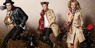
Burberry has launched a campaign to celebrate 15 years of billy elliot staring Romeo Beckham, James Corden, Niomi Campbell and Michelle Dockery. They have recreated the opening scene by jumping in the air in slow motion wearing the clothes. 
I love that they have incorporated the musical and made it fun with the confetti and used a mixture of celebrities not just stereotypical models making it stand out. 
click here to watch the ad'.

Neflix's way to get your kids to go to bed


Netflix has targeted parents with young children that don't want to go to bed. They came up with a 5 minute episode scheme that you can get your kids to bed by making the deal they can watch one episode before they go. This makes bed time seem like a treat so they will no longer think of it as something they don't want to do. 


Its called Dinotrux and kids both male and female love the mini show. A famous youtube star 'BATDAD' has helped voice the campaign with his kids. 
click here to watch his video. 


John Lewis Christmas Ad 2015


The John Lewis ad' never fails to bring the public a happy tear. It is based on a little girl called Lily feeling sorry for the man on the moon being all alone at christmas time. She tries to send him messages but her attempts fail till on christmas day she sends him a telescope by balloons so he can join in the christmas cheer from his little house on the moon. 

The message of the ad' is to 'show someone they're loved on christmas'. I feel the ad' perfectly grasps this concept through the imagination of children that there is a man on the moon. 
The store is aiming to raise thousands of pounds for 'Age UK'. This is to help elderly people that might be alone over the holidays. Their slogan is 'no one should have no one at christmas' echoing the one used by John Lewis in the ad'.
click here to watch the ad'


Starbucks Logo


Starbucks was founded in the 1970's where its logo was designed by Terry Heckler a little differently to how it is today. 
As you can see the logo is similar however it is less animated and the woman is topes. The purpose for this was that the woman was meant to draw in the business men of Seattle just like coffee does to people that enjoy caffeine. The mermaid like image is a 16th century siren with two tails that would draw its victims in with its beauty and song then kill them. However over time it was seen as offensive to have the woman bare chested so the brand had to adapt the logo to be a little more modest.


Wednesday 4 November 2015

Adele- Hello


Adele's new song 'Hello' has swept the world at top speed since its release on the 23rd of October 2015. It is her first song since 'Skyfall' in 2012 and has gained popularity even quicker since the Bond Film song release. The song has also been popular when creating funny videos using the song and although this is probably not what Adele had in mind when releasing it, it has increased its popularity. click here for an example.
Over just 5 days the song reached over 100 million views on youtube which is faster than any song in 2015 proving a success for Adele. 
click here to watch the music video.


Monday 2 November 2015

Evan Williams- 'why i don't care if Instagram has more users than twitter'


'I don't give a shit if Instagram has more users than Twitter'
Evan Williams was recently quoted saying this in the press. However there was no emphasis on the word if so he wasn't saying there were more people use Instagran than twitter. He is proud of Twitter as it is exactly what it is meant to be, a live information network publishing important news. He doesn't care if more people are sat looking at pretty pictures as the networks were built for completely different purposes.
However, his rant was less focused on Instagram but rather how the press are so one-dimentional when reporting and how they compare things in negative ways. Realistically both social medias were created for different purposes and attract different but also the same audiences so the amount of users is irrelevant. Both are developing successful networks and this is what should be advertised. 


Thursday 29 October 2015

Nissan Quashqai Imagery


This ad uses the imagery of a story book to promote the new Quashqui. The slogan for the ad' is 'your story starts here' creating an imaginative feel by using the pages as the road. As it folds the car smoothly dodges the high rise modern buildings saying 'no matter what the road throws at you', this suggests the car is 'special' and can do anything you need. Overall i feel the ad' communicates its message of the new and improved car well by straying from the ordinary and allowing the audience to make the connection between the imagery and the slogan. 
click here to watch the ad'

Wednesday 28 October 2015

Virgin Media 'Inspired'


I saw this ad' in the cinema and its message is special especially for a female audience. It is based around the little girl being inspired by successful women if today and from her mums past. Using celebrities as her role models she is intrigued by their succeses and feels 'connected' to them. This could be linked to the new film 'Suffragette' and where the success of women was born and recognised. I love the link between the internet 'connection' and the connection she feels to these people as they look into the camera straight at her through the screen and she feels personally attached. The song is also linked 'girl on fire' which really adds to give you those goosebumps when you are emotionally connected to something.
click here to watch the ad'  


James Bond trend


Heineken has been taking advantage of the new James Bond film to advertise its products and i actually saw this prior to watching the film in the cinema. This makes the product desirable to its over 18, predominantly male audience. It does this through the sophisticated, smooth personality of Bond and makes them think Heineken will make them seem this way. This however also promotes the film and its release that people are excited for so pay more attention to the ad'.
click here to watch the ad'